university brand
- President's message
- Assessment policy
- Objectives related to human resource development and other educational and research objectives/educational goals/three policies
- Founding spirit
- Various policies
- Rissho University episodes
- Introduction of past presidents
- university brand
- academic organization
- Administrative organization
- Facility introduction
- Public relations magazine
- FD (Faculty Development)
- university evaluation
School emblem and mascot character
The scent and color of tachibana have been in the hearts of Japanese people since ancient times. ) can be seen even if it is smeared.'' ``The fruit of the tachibana, the flowers, the leaves, the branches with frosting, and the everlasting leaves of the tree.'' Tachibana is known for ancient poems such as ``Tachibana is found in both flowers and fruits, but moi ya, ni ni hoshi mi ga hoshi'' (``Man'yoshu'').
school emblem
Rissho University emblem is supported by a tachibana (tachibana flower), which represents "university."
The tangerine tree was a favorite plant of Saint Nichiren, and the fragrance of its pure white flowers and the lustrous shine of its green leaves symbolize our university as a garden for people who seek truth, respect justice, and pray for peace, and who devote themselves to study and practice.
The school color, green, comes from the fact that the tachibana flower is evergreen, and represents the breath of new life and eternal vitality that permeates the school.
Furthermore, the fact that the fragrance and color of tangerines have captured the hearts of Japanese people since ancient times is known from old poems such as "The fragrant tangerine flower, pierced into a jewel, sends off to my younger sister, even if she is dappled with love," and "Tangerines, even their fruit, flowers, and leaves, Though frost falls on their branches, They are everlasting trees, and "Tangerines, although I admire their flowers and fruit, I no longer want to see them in time" (Man'yoshu).
Mascot character "Moralis"
Why RIS?
The name "Moralis" is used on the university's homepage and in email addresses, and the letters, words, and sound of the name are already familiar to students at Rissho University. The name "Moralis" was also chosen by a vote of students.

Moralis (anime illustration version)
What is the wish for RIS?
The squirrels collect nuts little by little and bury them in the soil here and there in the forest. The seeds grow and provide a happy environment for the animals, plants, and forest friends that inhabit the forest. We hope that such a character will be a source of energy for each of us Rissho University students, which we will nurture greatly over the next four years.
Symbol mark and logo

symbol mark
Rissho Educational Corporation has established a symbol mark in preparation for its 150th anniversary in 2022. After voting by many people, including faculty, staff, and related parties, as well as students, the symbol mark was chosen to incorporate the thoughts of the various stakeholders of the school.
Concept: Future-oriented, dynamic, and connected to society based on tradition
The shape, in which a larger R is created from one R, represents the school's leap forward into the future and its will to connect with wider society. The two overlapping R's also symbolize the university's brand vision of ``Moralist'' and ``Expert,'' as well as the educational goals of junior and senior high schools, ``Gyugaku Nido.'' It is also a form that overlaps with the students of our school who study hard, grow greatly, and fly towards society. Our hope is that you will take advantage of what you learn at the school and play an active role in society.
The color is a youthful and bright blue. Looking up at the verdant tachibana (school color), the blue sky as clear as the blue sky is a sign of the determination of current students, alumni, faculty and staff to add a new, pure color to the school. represents.
logotype
Along with the symbol mark, various text logos have also been reborn. Both the Japanese and English text use strong, thick lines to express "Rissho" in bold letters. The color is a youthful and bright blue. Looking up at the verdant tachibana (school color), the blue sky as clear as the blue sky is a sign of the determination of current students, alumni, faculty and staff to add a new, pure color to the school. represents.
Hiromura Design Office Representative Masaaki Hiromura
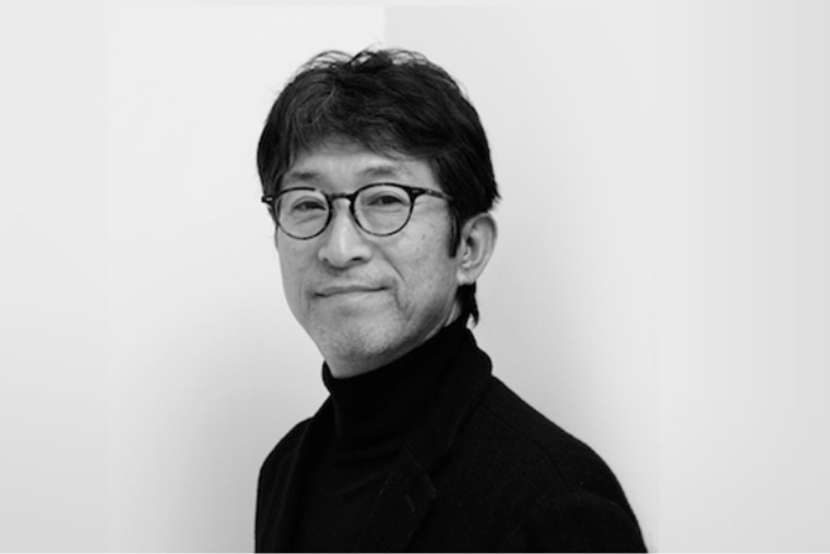
Hiromura Design Office Representative Masaaki Hiromura
In 1977, joined Ikko Tanaka Design Office. Established Hiromura Design Office in 1988. He has won numerous awards including the 2008 KU/KAN Award, the 2009 Mainichi Design Award, the 42nd SDA Grand Prize, and the 2010 Good Design Gold Award. Main work is Miraikan CI and signage project. Yokosuka Museum of Art VI Plan. 9h Nine Hours AD, signature plan. Sumida Aquarium VI, signage plan. Tokyo Station Gallery VI, signage plan. Abeno Harukas sign plan. Prime Tree Akaike sign plan. AD for Sogo, Seibu, Loft, etc. Major exhibitions include ``Junglin: The Moment When Consciousness Moves'' (Seibu Gallery), ``Junglin 2: Consciousness in the Unconscious'' (Axis Gallery), and ``Junglin' in Kanazawa'' (21st Century Museum of Contemporary Art, Kanazawa). His publications include ``Graphism of Space'' published by Rokuyosha, ``Jihon JI BORN'' published by ADP, and ``From Design to Design'' published by ADP.
